
The Power of Data Visualization
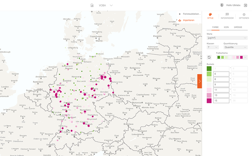
Data visualisation is an easy and effective tool to present correlations. This map shows, how easy it is to get a simple answer to a complex question. In this map you can see locations with highlevels of air pollution in Germany.
The data comes from a statement by the Deutsche Bundestag in response to a request by The Greens (BÜNDNIDS 90/DIE GRÜNEN) – 24 pages full of numbers and explanations. It’s obvious how much more insights one could get by the visualization of data. Clearly visible are the deep red coloured areas that mark the places that are most polluted. With our business intelligence tool ATLAS it is really easy to discover and analyze spacial interdependencies.