
How to visualize data on Google Maps with deck.gl
Visualizing large datasets on a map is not easy, you say? In this article, our developer Robert shows how to do just that in 160 lines of JavaScript using deck.gl on Google Maps, loading data from Google Sheets.
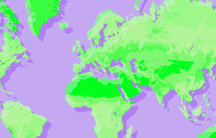
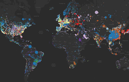
We are going to use a large open dataset with information on power plants from all over the world, which should be interesting to visualize. When we’re finished, the visualization will look like this:
Read on to discover how we build this map.
Get the data
First, grab the CSV data from the World Resources Institute and upload it to Google Sheets.
As we won’t need all the data in the document, it can be slimmed down by removing unneeded columns. This reduces the amount of data the visualization has to load. We’ll focus on the data in the six columns you see below. You can find the example sheet here and reuse it.
To show how power is produced, we will use the type of power plant to color a dot on the map. The size of the dot will be defined by the capacity of the power plant. Latitude and longitude will, of course, be used to place the dot on the map.
No native rendering of large datasets on Google Maps
There are almost 30.000 power plants in this dataset. Visualizing that much data on Google Maps is not without its problems. Using the Data Overlay provided by the Google Maps API is not very performant with that many items to render. Other methods such as using SVG as an overlay show similar performance problems with just a few hundreds of items already. So let’s take a look at deck.gl.
What is deck.gl?
deck.gl was published in 2016 and brought WebGL-based rendering to maps, using the graphics card in our device. This is great news for us as it promises fast render performance! At first, it didn’t work with Google Maps though. With the release of version 7 in April 2019, support for Google Maps was added and we’ll explore how easy it is to implement!
Of course deck.gl needs to be added to the visualization:
<script src="https://unpkg.com/deck.gl@7.0.9/dist.min.js"></script>
Create a Google Map
As a basis to render the data on, we create a Google Map. The Google Maps API is needed to create the map. Don’t forget to get an API key. It can be included like this:
<script src="https://maps.googleapis.com/maps/api/js?key=###YOUR_KEY###&callback=initMap"></script>
In the script tag, a callback is defined which will create the map when the API is loaded:
let map;
function initMap() {

map = new google.maps.Map(document.getElementById('map'), {

center: {lat: 17, lng: 0},

minZoom: 3,

zoom: 3,

clickableIcons: false,

disableDefaultUI: true,

zoomControl: true

});

}
Load data from Google Sheets
As we have the data of the power plants in our Google Sheet, we need to load that data first. To be able to pull data from a sheet, it needs to be published to the web. In the spreadsheet, go to “File” -> “Publish to the web” and click the publish button. The Sheet can now be consumed by our app!
To load it, a script tag is added to the page. Be sure to insert the ID of your sheet in the URL of the script tag. The ID can be found in the URL of your sheet following the /d/ part. For our example the ID is 1MsFYOQlys_jyTACIZRbk3VWX9qaUdfrsr_r2Y-oxuZo.
At the end of the script tag, we define a callback that get’s called when the data is loaded:
<script
src="https://spreadsheets.google.com/feeds/list/###SHEET_ID###/1/public/values?alt=json-in-script&callback=createOverlay">
</script>
In the callback, we can inspect the data loaded:
function createOverlay(spreadsheetData) {
  console.log(spreadsheetData);
}
Create a deck.gl GeoJSON overlay
Google Sheets gives us a JSON in a strange nested structure. To render that data as GeoJSON on the map, we need to create a GeoJSON first in the createOverlay callback:
const data = {
  type: 'FeatureCollection',
  features: spreadsheetData.feed.entry.map(item => {
    return {
      type: 'Feature',
      geometry: {
        type: 'Point',
        coordinates: [
          Number(item.gsx$longitude.$t),
          Number(item.gsx$latitude.$t)
        ]
      },
      properties: {
        name: item.gsx$name.$t,
        country: item.gsx$countrylong.$t,
        capacity: Number(item.gsx$capacitymw.$t) || 0,
        primaryFuel: item.gsx$primaryfuel.$t
      }
    }
  })
};
Note that we add information on capacity and primary fuel to the properties so we can use it for the styling.
To add that GeoJSON to the map, we create a regular GeoJsonLayer from deck.gl:
const geojsonLayer = new GeoJsonLayer({
  id: 'geojsonLayer',
  data: data,
  pickable: true,
  pointRadiusMinPixels: 2,
  pointRadiusMaxPixels: 140,
  wrapLongitude: true,
  getRadius: d => d.properties.capacity * 40,
  getFillColor: d => fuelColorMapping[d.properties.primaryFuel] || [100, 100, 100, 194]
});
The GeoJSON we just created get’s passed in. To calculate the radius, we use the capacity from the properties. The color of the dot is defined by the primaryFuel. We are using a mapping object with the fuel type as the key and the color array as the value.
This is a layer now, but it’s still not on the map.
Add a deck.gl layer to Google Maps
Both the map and the layer need to be connected to render the data on the base map. deck.gl provides a GoogleMapsOverlay which does exactly that. Create one and assign it the map:
const overlay = new GoogleMapsOverlay({
  layers: [geojsonLayer]
});
overlay.setMap(map);
Yay! The data can now be seen on the map!

It’s really interesting to see the distribution of hydro power plants across the globe. The amount of coal power plants in China and India looks alarming with regard to the current climate crisis.
Show an info window on click
Seeing the data on the map is great, but getting more information on the capacity or the name of the power plant would be a nice addition. An info window helps with that:
const infowindow = new google.maps.InfoWindow({
  content: ''
});
map.addListener('click', event => {

const picked = overlay._deck.pickObject({

x: event.pixel.x,

y: event.pixel.y,

radius: 4,

layerIds: ['geojsonLayer']

});
if (!picked) {

infowindow.close();

return;

}
infowindow.setContent(

`<div>

<div><b>${picked.object.properties.name}</b></div>

<div>${picked.object.properties.country}</div>

<div><b>capacity:</b> ${picked.object.properties.capacity}</div>

<div><b>type:</b> ${picked.object.properties.primaryFuel}</div>

</div>

);

infowindow.setPosition({

lng: picked.lngLat[0],

lat: picked.lngLat[1]

});

infowindow.open(map);
When the map is clicked, the overlay is checked for elements that can be picked at these coordinates. When none is found, close any open info window. Else, set the content to the data from the clicked power plants properties and open it at its location.

Wrap up
Loading data from Google Sheets and creating a Google Map with a deck.gl GeoJsonLayer on top is possible with just a few lines of code. Creating visualizations from large datasets just became a lot easier and hopefully, this article helped you get started!
What are you going to visualize? Let us know on Twitter @ubilabs or via info@ubilabs.com
Be sure to check out the complete source code of the example. You can find the stand-alone example right here: deck-gl-on-google-maps.glitch.me.